Enabling comparison mode
A toggle on the top right corner of the continuous profiling dashboard enables the comparison mode.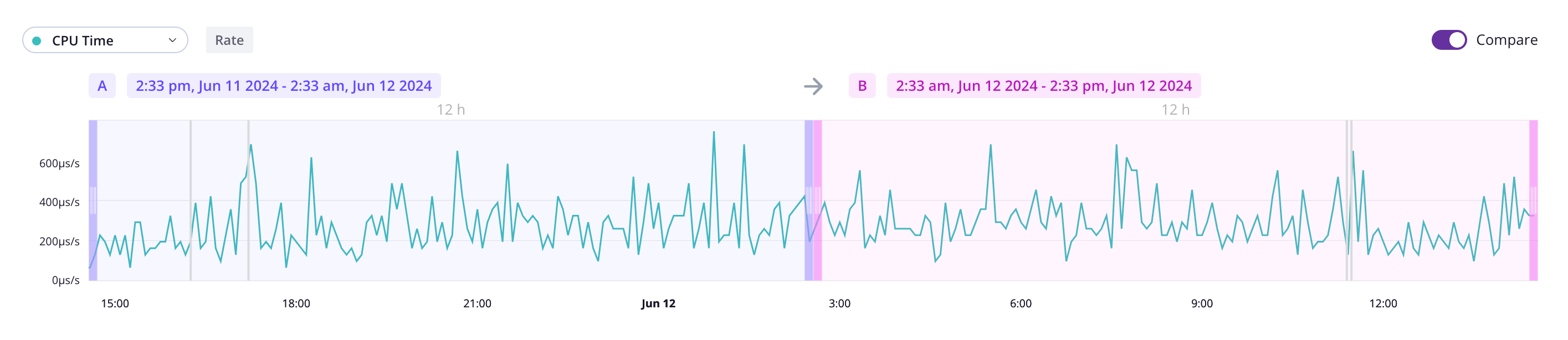
A and
B. Those times can overlap.
Understanding continuous profiling visual comparison
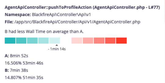
The flamegraph provides a visual representation of how timeframeB compares
to A for the selected dimension using shades of colors. The stronger the
color, the higher resource variation.
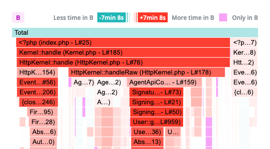
B is consuming less resources than A
for the selected dimension. Shades of red indicate the opposite.
A scale and contextual information are displayed when hovering a span. This ensures
accessibility for all users and allow colorblind users to benefit from this feature.