> ## Documentation Index
> Fetch the complete documentation index at: https://developer.upsun.com/llms.txt
> Use this file to discover all available pages before exploring further.
# Continuous Profiling dashboard
> Understanding the Continuous Profiling dashboard
export const ContinuousProfilingSellableBody = () =>
By default, Upsun offers 15 minutes of continuous profiling per project and for free.
To get 30 days of continuous profiling per project and for a fixed fee, upgrade to the Continuous Profiling add-on.
;
Continuous profiling is a multi-dimensional performance optimization technique
where web applications are monitored and profiled in real-time. Lightweight and
scalable, it's tailored for holistic application oversight.
Continuous profiling collects performance data continuously, enabling developers to
gain deep insights into their application's behavior, identify bottlenecks, and
optimize code for better performance and resource utilization. This proactive
approach allows for quicker identification and resolution of performance issues,
ensuring the smooth running of software in live environments.
## Continuous profiling on Upsun
Upsun Continuous Profiling is powered by [Blackfire](/docs/observability/application-metrics/blackfire).
Continuous profiling data is also one of the observability signals correlated by the [Upsun performance agent](/docs/get-started/ai/upsun-performance-agent), which analyzes up to 7 days of profiling and traffic data alongside your application source code to generate a performance analysis report with recommendations.
To access Continuous Profiling in the Console:
1. Open your project in the Console.
2. Select **Apps and Services**.
3. Select your **app**.
4. Click **Profiling**.
The Continuous Profiling dashboard lets you visualize the profiling data of a specific application.
It is composed of several views: flame graph, table view, and a split view combining the flame graph and table views.
Each view helps make sense of the profiling data for the selected dimension and time frame. The available dimensions vary with the runtime profiled.
## Color-coded node dimensions
Upsun continuous profiling dashboard employs a color-coded system to represent each dimension, ensuring consistency across different runtimes.
The intensity of a node's background color is directly proportional to the resources it consumes. As resource consumption increases, so does the vibrancy of the background color. This visual representation pinpoints application areas that may require optimization.
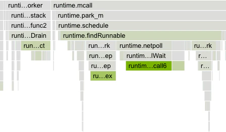 The contrast between the dimension color and the grayscale of regular nodes has been designed to ensure accessibility for all users and allow colorblind users to benefit from this feature.
## Flame graph
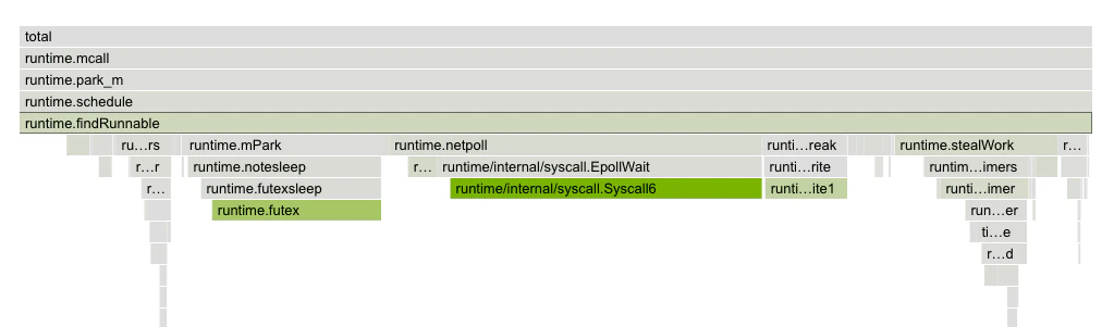
The flame graph is a hierarchical visualization of the contribution of the different function calls to the selected dimensions.
Flame graphs are effective in identifying performance issues and understanding the behavior of software during execution.
The contrast between the dimension color and the grayscale of regular nodes has been designed to ensure accessibility for all users and allow colorblind users to benefit from this feature.
## Flame graph
The flame graph is a hierarchical visualization of the contribution of the different function calls to the selected dimensions.
Flame graphs are effective in identifying performance issues and understanding the behavior of software during execution.
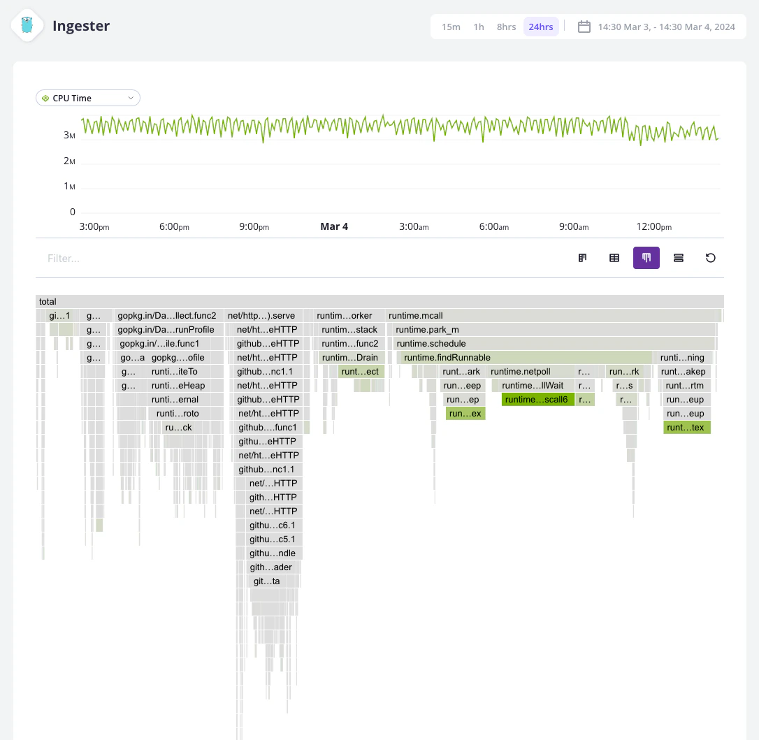 Rectangles in a flame graph are called frames. Each frame represents a function, arranged vertically (y-axis) to show the sequence of method calls.
The width of a frame relates to its resource usage. It helps pinpoint the most resource-intensive function calls. Their colors are not performance-related. They are meant to differentiate between functions.
Horizontally (x-axis), methods are sorted by name, not the order in which they run.
Hovering a frame displays in-depth information on it.
Rectangles in a flame graph are called frames. Each frame represents a function, arranged vertically (y-axis) to show the sequence of method calls.
The width of a frame relates to its resource usage. It helps pinpoint the most resource-intensive function calls. Their colors are not performance-related. They are meant to differentiate between functions.
Horizontally (x-axis), methods are sorted by name, not the order in which they run.
Hovering a frame displays in-depth information on it.
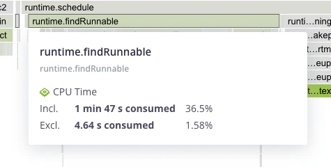 Clicking on a frame narrows down the flame graph to the callers and callee nodes of that frame.
 ## Table view
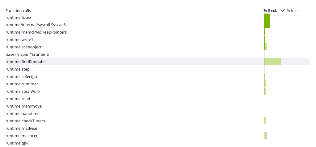
The table view displays a list of all the frames sorted by their resource consumption, for the selected dimension and time frame. By default, the table is sorted by `exclusive` resource consumption, which is the total value of the frame, minus the combined total values of its direct children.
## Table view
The table view displays a list of all the frames sorted by their resource consumption, for the selected dimension and time frame. By default, the table is sorted by `exclusive` resource consumption, which is the total value of the frame, minus the combined total values of its direct children.