> ## Documentation Index
> Fetch the complete documentation index at: https://developer.upsun.com/llms.txt
> Use this file to discover all available pages before exploring further.
# Comparing Continuous Profiling Timeframes
> Comparing continuous profiling timeframes
export const ContinuousProfilingSellableBody = () =>
By default, Upsun offers 15 minutes of continuous profiling per project and for free.
To get 30 days of continuous profiling per project and for a fixed fee, upgrade to the Continuous Profiling add-on.
;
Upsun Continuous Profiler dashboard allows comparing two timeframes to better
understand application dynamics in various contexts.
You could compare two versions of the application, before and after a deployment,
or rush hours with quiet times for instance.
## Enabling comparison mode
A toggle on the top right corner of the continuous profiling dashboard enables
the comparison mode.
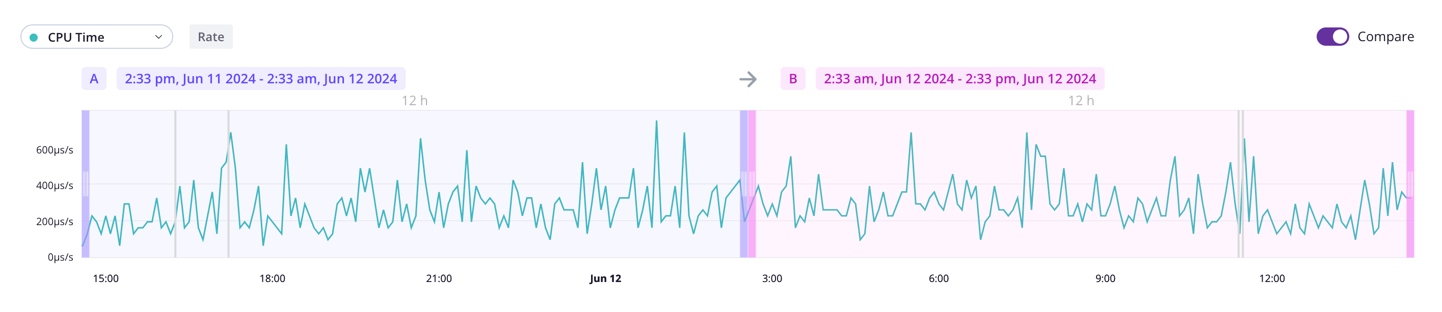 With comparisons enabled, you can select two timeframes referred to as `A` and
`B`. Those times can overlap.
## Understanding continuous profiling visual comparison
The flamegraph provides a visual representation of how timeframe `B` compares
to `A` for the selected dimension using shades of colors. The stronger the
color, the higher resource variation.
With comparisons enabled, you can select two timeframes referred to as `A` and
`B`. Those times can overlap.
## Understanding continuous profiling visual comparison
The flamegraph provides a visual representation of how timeframe `B` compares
to `A` for the selected dimension using shades of colors. The stronger the
color, the higher resource variation.
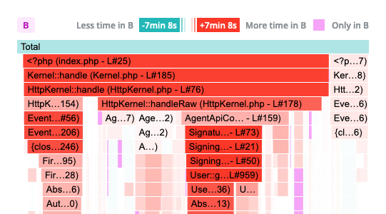 Shades of green indicates timeframe `B` is consuming less resources than `A`
for the selected dimension. Shades of red indicate the opposite.
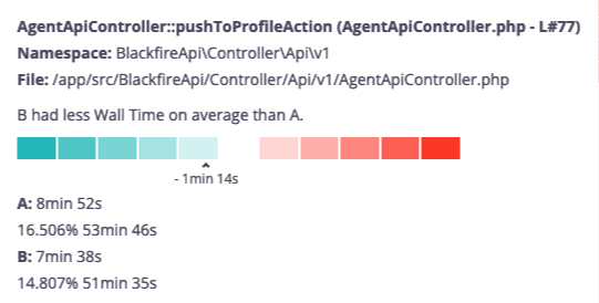
A scale and contextual information are displayed when hovering a span. This ensures
accessibility for all users and allow colorblind users to benefit from this feature.
Shades of green indicates timeframe `B` is consuming less resources than `A`
for the selected dimension. Shades of red indicate the opposite.
A scale and contextual information are displayed when hovering a span. This ensures
accessibility for all users and allow colorblind users to benefit from this feature.